Hi folks! Long time no see! I hope you’ve missed me, becuase we’re getting back into it with a little look at some of the updates to the homes of the premade families in the Sims 4. Now I’m not much of a builder, nor do I know much about interior design, but I do have an unqualified opinion so I’m here to share it with you all. Enjoy!!
The Pancakes House
Of course first up has to the Pancakes house and I have to say, I like it a lot! The updated flooring was a great choice, it makes the house so much brigher. They’ve made much better use of the space in the updated version too, like the extra bathroom under the stairs and changing the awkwardly sized bathroom upstairs. The whole house looks much more up to date without changing the overall vibe of it.
I really like the new additions to the house too, like the conservatory and the man-cave in the basement. The new house suits them so much more, rather than looking like it was inherited from Eliza’s grandma and they didn’t bother changing the furniture. Compared to the refresh, the old version looks so dated, and I think they’ve done an excellent job.
Personally, I think the room that’s had the biggest glow up is the kitchen. If we compare the two…

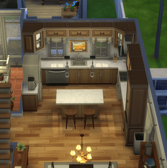
…I probably don’t need to explain how much better this is.
That’s one down, and so far I’m impressed! I’m a big fan of the updated pancakes house.


the old Pancakes house

the new Pancakes house
The Goth House
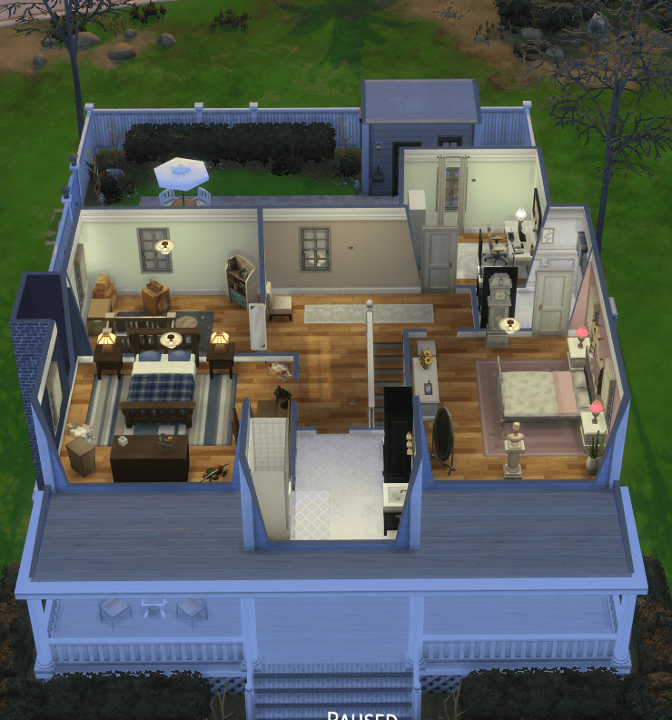
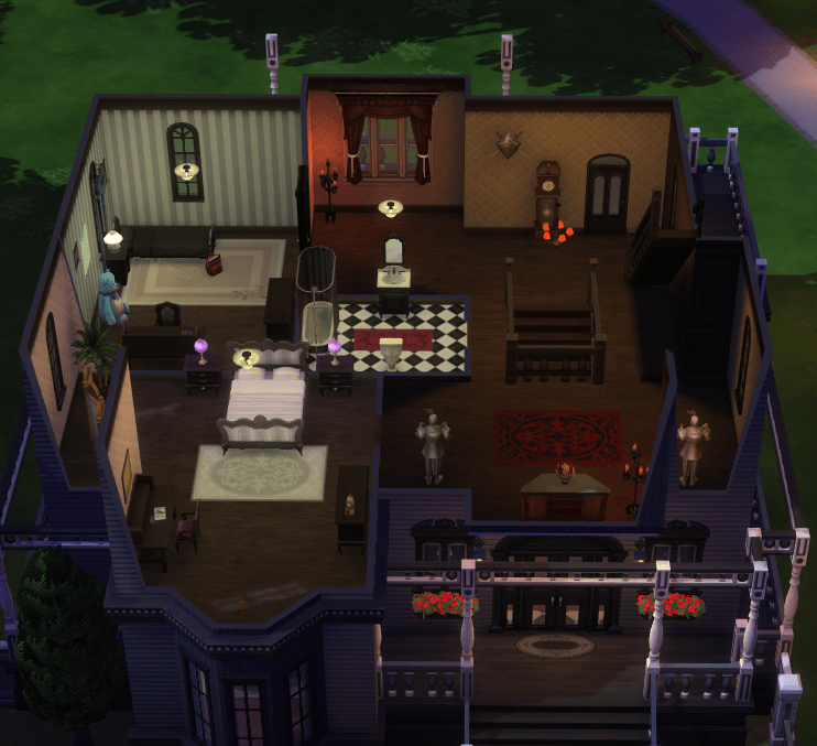
I was excited for this one! The Goths are iconic so I really wanted this to be good, but it fell short of expectations. The bottom half of the house is so empty I’m still not sure if something was wrong with my game…
The kitchen is particularly offensive to me, mostly because it looks like the kitchen you build after you move your sims into a new starter home and the kitchen is all on one wall becuase you have no money so you place the oven, fridge and one counter and call it a day. This is the first kitchen you build when you boot up the sims for the first time ever at ten years old. This is the kitchen you build when you weren’t paying attention to how much money you were spending furnishing the house so you run out of money halfway through and have to have a half – finished kitchen. Please get it away from me.
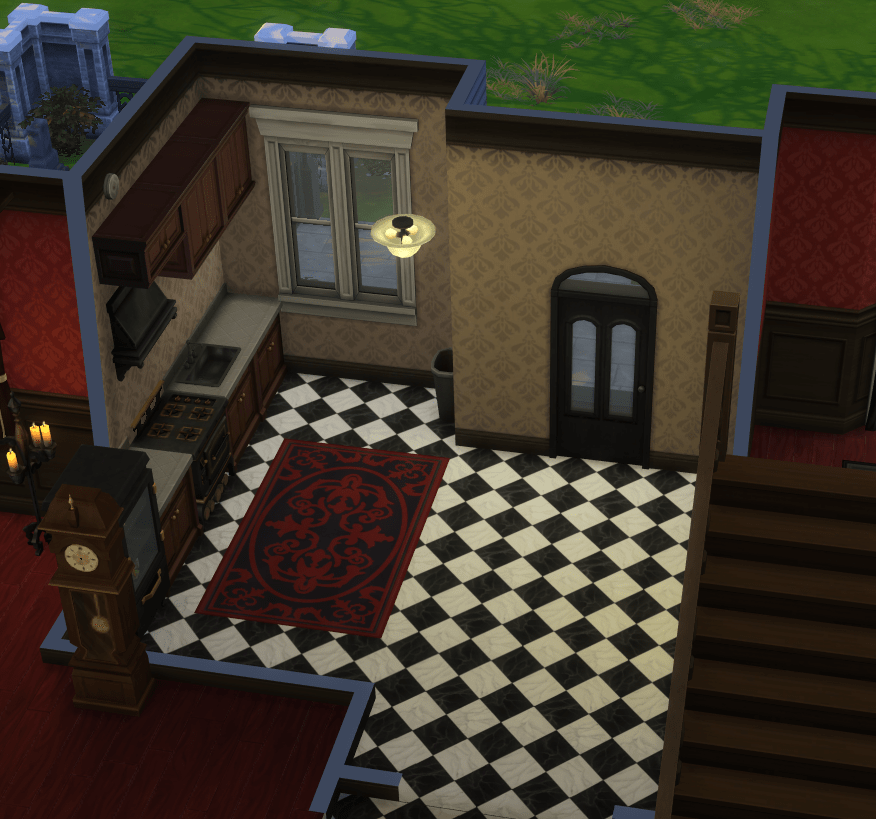
the Goths’ new kitchen
That being said, I do appreciate some of the details added in the updated Goth house, such as the telescope on the balcony. I think that this is a reference to Bella’s disapperance in the Sims 2, although perhaps I’m thinking too deeply into it. Intentional or not, I still enjoy this detail as a callback to the older games, so this one gets a thumbs up from me.
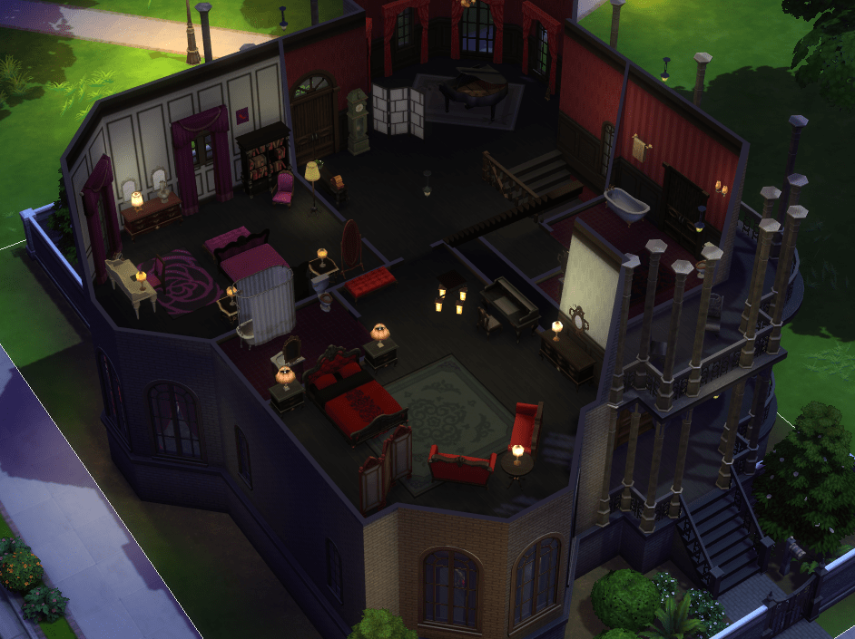
Then we have what I assume is Bella and Mortimer’s bedroom. Now, let me be clear. Do I think it’s well designed? No. Do I love it anyway? Yeah, kinda.

For example, this little hole behind their bed. I don’t know what this is, I can only assume it’s there for ‘making the outside look better’ purposes, but I think it’s fun! It makes it feel like a quirky rich people’s home, which I think fits the Goths well.

Their bathroom is also very intriguing to me! Why is there a man holding the towels. Why does only one window have a curtain on it. Why is there a tiny rug in the middle of the room that isn’t even acting as a bathmat. I don’t know, but it rocks.
So, to summarise the new Goth house… well, they definitely made changes! In all seriousness, I like that the house is a bit quirky, but unfortunately nothing excuses not building a proper kitchen.


the old Goth house


the new Goth house
Yes, I am still hung up on that kitchen. It’s upset me so much I think I’m going to have to sign off, but I’m full of ideas right now so I’ll be back soon! In the meantime, if you want to draw your own comparisons, the old versions should be in your game library under ‘legacy version’.
Until next time 🙂

Leave a comment